
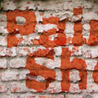
In this tutorial you are going to learn how to use displacement maps to create realistic looking overlay effects that appear to be actually painted onto the surface. Displacement maps simply follow the contour of any texture, and then produces natural looking distortion effects on the layer above it.
For example, if you painted your name on a rock or tree in real life, the paint would follow the contours of the rocks or bark and there would be a natural distortion. However, in Corel Paint Shop Pro X2 if you paint text over top of a texture without using Displacement maps, the text wouldn’t have any distortions, it would just be straight. Displacement maps will allow you to recreate or mimic natural distortions that occur in real life. You can use displacements maps to apply a painted text effect on bricks, rocks, walls, concrete, wood, grass, metal, water, cliffs, etc,. or whatever other kind of texture you want to use. The displacement maps can be used to create distortion on any other type of image as well. For example, if you wanted to make a logo and/or a photo of yourself appear to be painted on, then you can apply this same process. Lets go ahead and get started painting some graffiti on some walls paint shop pro style. One final note, displacement maps are available in all Paint Shop Pro versions 9 and above.
Step 1
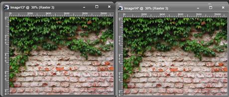
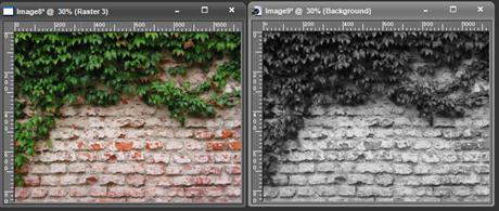
Open up any photo with any texture. I used this stock photo of a brick wall. Then duplicate the photo so that you have two actual copies. To duplicate simply press SHIFT + D on your keyboard.
Step 2
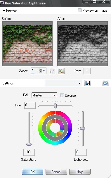
Select either one of the two images, and turn the saturation all the way down using the Hue/Saturation/Lightness tool, so it becomes black and white.
Step 3
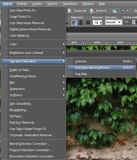
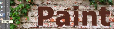
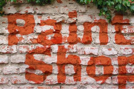
Next, take note of/remember the image number and/or name of the black and white photo, but make sure you don’t close it. Now, go back and select the color version of the image, and then create a New Raster Layer (Layers > New Raster Layer). Select the new Raster layer. Next, select the text tool by pressing T on your keyboard, and then write some text on one of the surfaces/textures in your photo. You can use any color you want for the text. NOTE: large/bold font will produce more realistic results.
Step 4
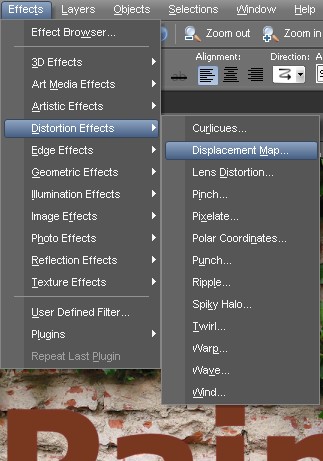
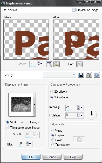
Now that you have finished writing the text, convert the text layer to a raster layer by right clicking it and selecting Convert to Raster Layer. Now we are going to apply the displacement map to our color image by going to Effects > Distortion Effects > Displacement Map. Inside the displacement map tool, select the black and white image (remember you noted the image number earlier) to use as your displacement map. You can use the default settings and/or the custom settings you see in my displacement map settings below. I raised the intensity to 30 to give a more rigid realistic looking effect. I suggest you use a higher intensity than 10 so that you get more distortion. You can adjust/ experiment to your liking.
OPTIONAL: You can permanently save the black and white image as a displacement map. I don’t do this because I always just use the original texture, duplicate it, then de-saturate, and use it on the fly. However, if you want it to be available the next time you use Displacement maps, simply save the black and white image as a bmp into My Documents/My PSP Files/Displacement Maps folder.
Step 5
Finally, change the blend mode of the text layer Hard Light, or a blend mode that looks the best for your photo. Note: It’s good to experiment with different blend modes and opacity for different surfaces/textures to see which gives the most realistic results. Overlay, Color, Multiply, Hard Light, Soft Light, and Burn are all good candidates to try.
9 Responses
Once again, a great tutorial. Thanks torQQue.
How do you change the blend mode to HARD LIGHT? i cant find it its confusing please explain
easy to follow the step by step tutorial that you have shared.. thank you for making that so simple.
Artistic tips. Thanks for sharing such tutorial. This seems very realistic.
Hi Jarrod
I have PSP 9 and PSP X2 I woulld love to be able to learne how to manipulate photography .I am a 52 years old disable lady, with no chances to do much, I find your tutorials very easy to folow , thank you for your help.
LISA CARRIER
Great tutorial. I use my PSP X2 on a daily basis, but never once used Displacement Map. Now I know how!
Thank you!
Nice tutorial, very realistic, love how you can manipulate images through photoshop awesome. PSP X2 best invention ever.
awesome, thanks!
great one!